Updated Crouton Boxes
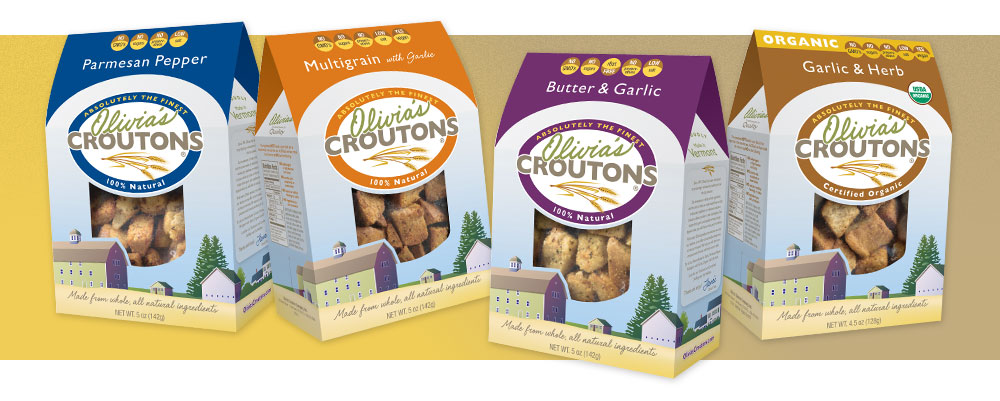
Adding new icon buttons at the top of each box help consumers quickly identify what makes Olivia's Croutons stand out from their competitors. In addition, the flavor differentiating color was extended to the top of the box for faster and easier consumer recognition. The addition of color creates a marked difference from the original simple white packaging. While the white package stood out on shelf, the design was not representative of product quality. Gray Cat Studio's beautiful illustration featuring golden hues of wheat and the historic barn, (where the croutons are made), convey the company's farm to table message.