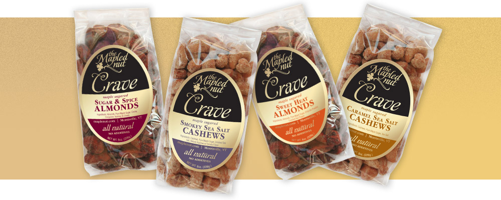
Crave Labels
Revamping an existing design for an established brand can be a tough nut to crack. The Mapled Nut Company wanted to expand into new markets, while being careful not to alienate their existing customer base. We chose to keep the one-color design printed on gold foil as a way of maintaining brand familiarity as well as for aesthetic and budgetary reasons. But we upgraded the look with a reworked logo and the expansion of color use for flavor designation. The resulting designs are both eye catching to new customers, while still familiar to old ones — everyone is nuts for them.